I have based my research on the UK’s Department for Transport data. I investigated and found patterns and trends in Road Safety in various Local Authorities across the country.
Analysing over 350k rows of data, I saw patterns of how likely and when road accidents happened; from time of the day to weather patterns; from road types, road surface conditions to speed limits.
An interesting point was the reasonably sharp increase in accident numbers in February 2020, right after the lockdown restrictions were lifted.
Defining the Question
What were the critical factors involved in the road casualties increase in the UK between 2020 and 2021?
Key Performance Indicators (KPIs)
Primary KPIs
The total number of casualties from Jan 2021 to Dec 2022 in the United Kingdom
Breakdown Total Casualties into categories Fatal, Serious, and Slight categories
Display quantities and the percentual representation of each category
Secondary KPIs
Break down casualty numbers into subcategories such as vehicle type, speed limits, road types, road surface conditions, time of the day, and urban or rural areas.
Display monthly trends comparing numbers from 2021 and 2022
Collecting Data
I have looked at different resources to gather the data I needed to help me answer my proposed question. Two critical criteria were always on my mind: the data must be reliable and accurate.
I downloaded the data from The UK’s Department for Transport Custom Data Download tool. Due to restrictions on the number of items to be selected at one time, five at most, I had to download three ODS (OpenData Spreadsheet) files and combine them into a single Excel workbook.
Cleaning the Data
Cleaning the data was very straightforward since it came from an official government source. I still double-checked the data for possible spelling mistakes and row duplication.
I decided to remove columns I felt were irrelevant to my analysis as info on the “Local Police Authority” or the “Level of Economic Development” of the regions.
I have broken down the “Accident_Date” column into “Month” and “Year” columns to use them to filter data.
Analysing the Data
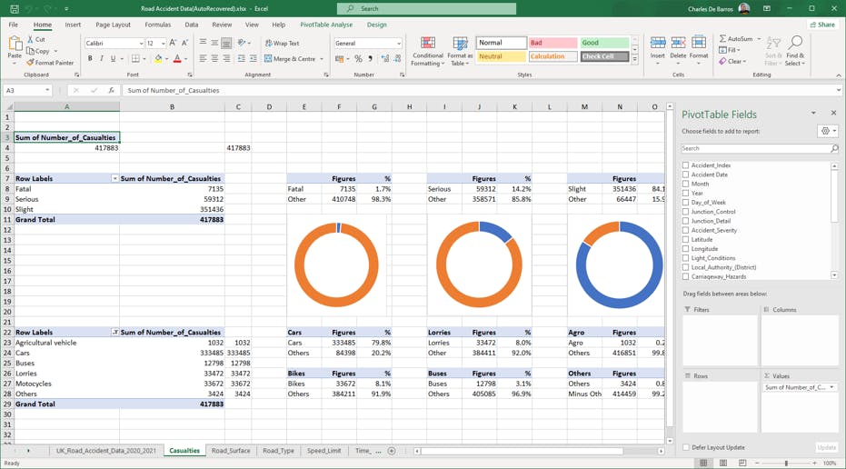
I have heavily used Pivot Tables to help separate into subcategories and focus on one aspect of the data at a time. I used specific values and rows to calculate, for example, the percental representation of casualties by seriousness and the kind of vehicles involved, as displayed below.

Presenting the Data
After analysing various aspects of the data, I designed a Dashboard to present my findings and make the data visualisation easier to understand.
One of the jobs of a Data Analyst is to present the data in an understandable format. The choice of a colour pallet is crucial.
Since my analysis findings represented figures related to casualties, I used a more neutral colour pallet for my dashboard.
The Dashboard
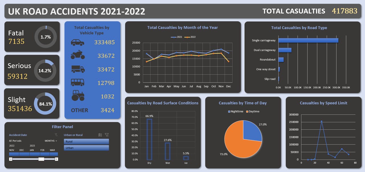
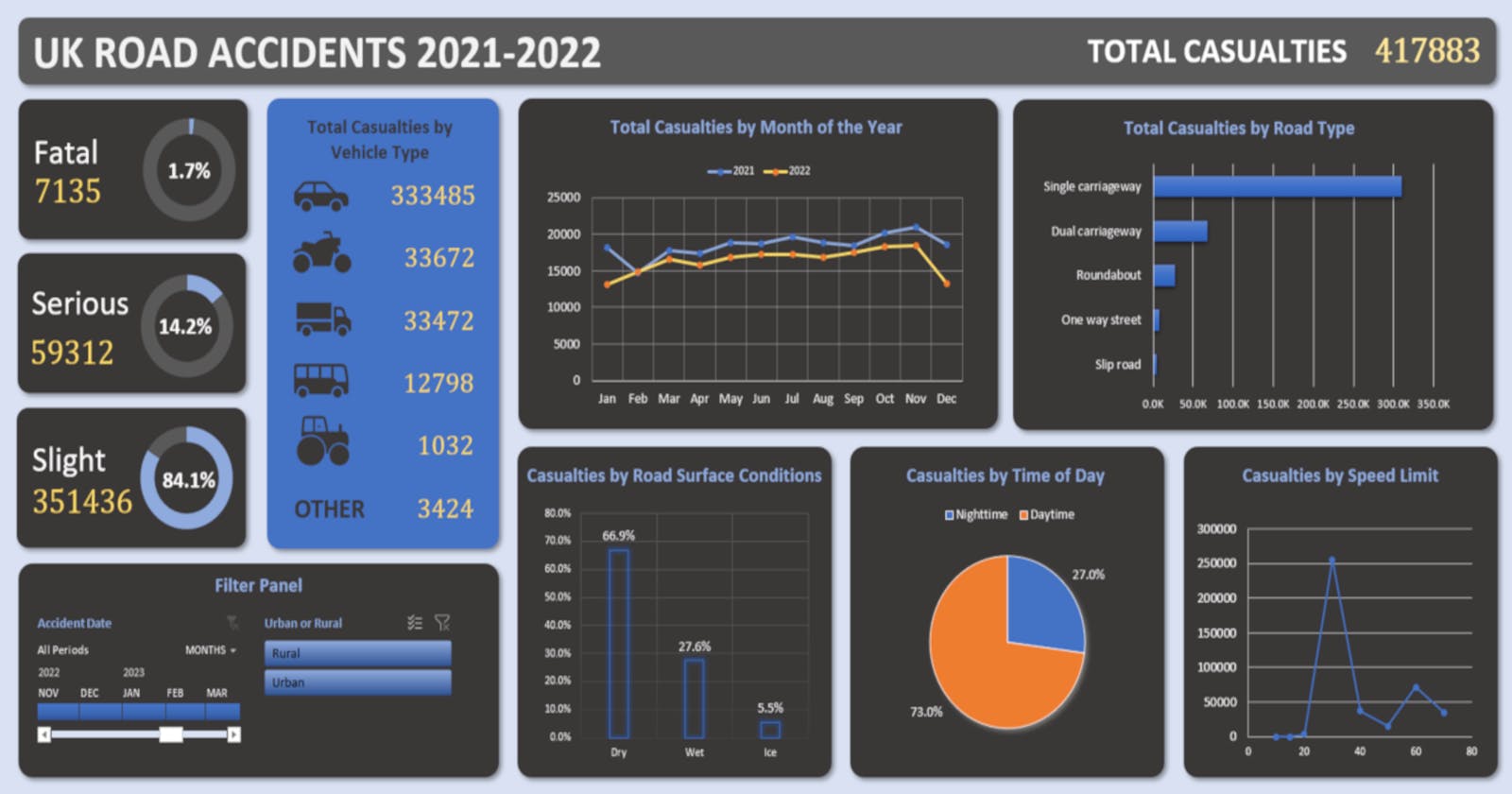
As a result of the data analysis performed, I created the dashboard visualisation below:

The Insight Gathered
Out of the over 350k rows of data in the dataset, a pattern emerged on the regular increase of road casualties starting from the warmer months of the year, May until November, with a drop in numbers from December to February. There was a specific sharp increase in numbers in February 2020, the time when the Covid-19 Pandemic lockdown restrictions were lifted.
Almost three-quarters of accidents occurred during daytime; and over two-thirds in dry road conditions. There is roughly a 5:1 ratio between Single Carriageway and Dual Carriageway incidents; a significant amount of casualties happened at about 30mph.
Considering that many Local Authorities have set a 20mph speed limit in many urban zone roads, occurrences of serious and fatal casualties will likely decrease.
Investment in more visually adequate night-time signalling and night driving awareness campaigns should also help decrease the number of night-time accidents.
The PowerPoint presentation for my final project can be found here.

